CHOBANI'S REBRAND — FROM FARM TO SPOON

Illustrator, Indesign, After Effect, Blender | 3D Design | Logo Design | Brand & Identity Design | 2024


When I set out to design a visual identity rebrand for Chobani, I kept asking myself: How can I create an identity that truly expresses the company’s history, values, and aspirations? Chobani has a rich story, from its beginnings as a small yogurt company to becoming a household name known for quality, freshness, and affordability.
I’ve always been fascinated by documentaries about the process of product creation. For instance, I’ve watched how airplane food is prepared—it's a highly complex supply chain involving numerous factories and workers. I’ve also had experiences like eating at Ichiran Ramen in Japan. What struck me the most was how every seat had a delicate board in front of it, explaining the “rules” of ramen making. The most impactful rule I read was that once noodles are added to the soup, they must reach the customer within 15 seconds—so the store was designed with exactly 28.8 meters between the kitchen and each seat to ensure this quality. This kind of attention to detail in brand design and process really stuck with me.
I watched Chobani's documentary on the yogurt-making process. From sourcing fresh milk from local farms to manufacturing, fermentation, pasteurization, and rigorous quality control, I saw the effort and care that goes into every step.
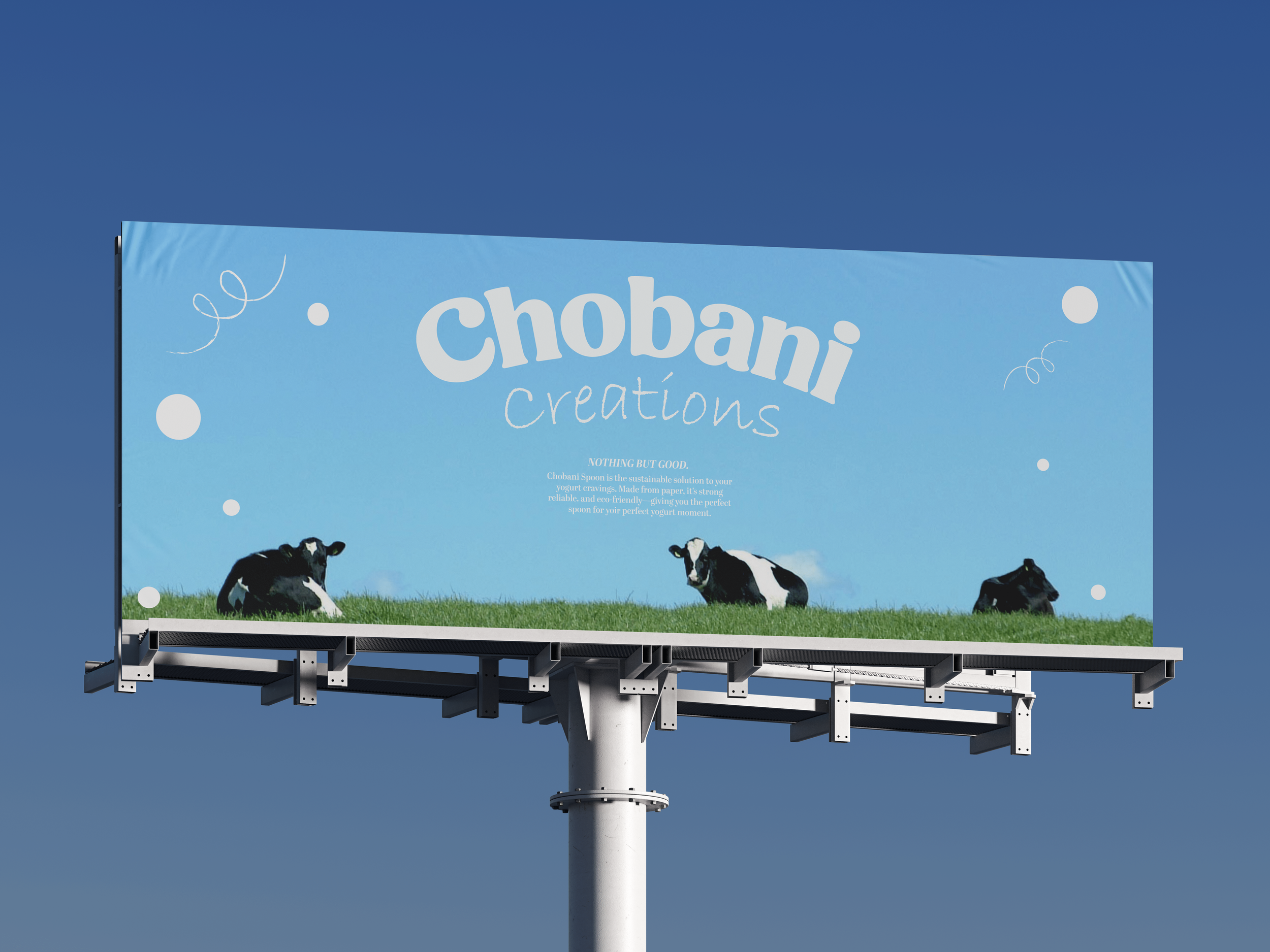
The challenge, then, was to create a design that would feel both rooted in tradition—reflecting Chobani’s commitment to authenticity and quality—and modern enough to attract customers with a playful, fresh aesthetic. But I also wanted it to be mindful of Chobani’s organic values. The brand prides itself on offering healthy, sustainable food, and I wanted the visual identity to reflect that same commitment.
By drawing inspiration from the company’s core values—quality, freshness, and affordability—I set out to craft an identity that not only tells the authentic Chobani story but also offers a more complete narrative. I wanted the new identity to go beyond just the visual; it needed to highlight the invisible elements—the care, the commitment, and the process—that make Chobani's yogurt special. In this way, the design would act as both a reflection of the brand’s history and values and a story that invites customers to appreciate the deeper, often unseen effort behind each product.